ISD Solutions
Branding & Visual Identity (Client Rebranding Project)
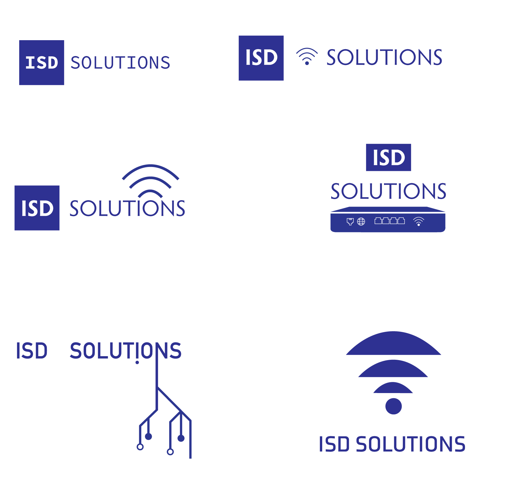
This project focused on rebranding ISD Solutions, an existing IT company. The objective was to modernize the brand while maintaining a professional and reliable image. A key challenge was designing a logo that was both fundamentally simple and featured a distinctive option capable of visually communicating their high-level, "white glove" service offering.
-
The logo was developed to meet two specific requirements: simplicity for standard use and a creative, symbolic variant.
Primary Logo: A clean, minimal design was created to ensure clarity and immediate recognition, suitable for everyday corporate use.
"White Glove" Variant: A secondary logo design was incorporated, featuring an abstract or symbolic element that visually represents the company's dedicated, premium level of service. The use of a simple yet evocative shape ensures versatility across various applications.
-
The color scheme for ISD Solutions utilizes a mix of professional tones to convey trust and technological capability.
The branding heavily features a dark, sophisticated blue/navy as the primary color, which traditionally signifies reliability, expertise, and stability—ideal for an IT solutions company.
This core color is complemented by a bright, contrasting accent color (like a vibrant teal or light blue based on the visual assets), used to denote innovation, connectivity, and clarity. This accent helps to modernize the look and highlight key design elements.


