Plant Lady Inc.
Branding and Visual Identity (Personal Project)
Plant Lady Inc. is a conceptual branding project for a modern, plant-based company. This comprehensive visual identity system was developed to embody the fusion of natural elements with delicate, feminine aesthetics.
The core creative direction was to establish a brand that is both fresh and elegant. The inspiration stemmed from exploring the combination of natural plant motifs with figurative models; a concept intended to give the brand a distinct, personalized, and organic feel. The final design delivers a visual language that speaks to health, beauty, and botanical refinement.
-
A versatile logo suite was created to ensure brand consistency across all mediums.
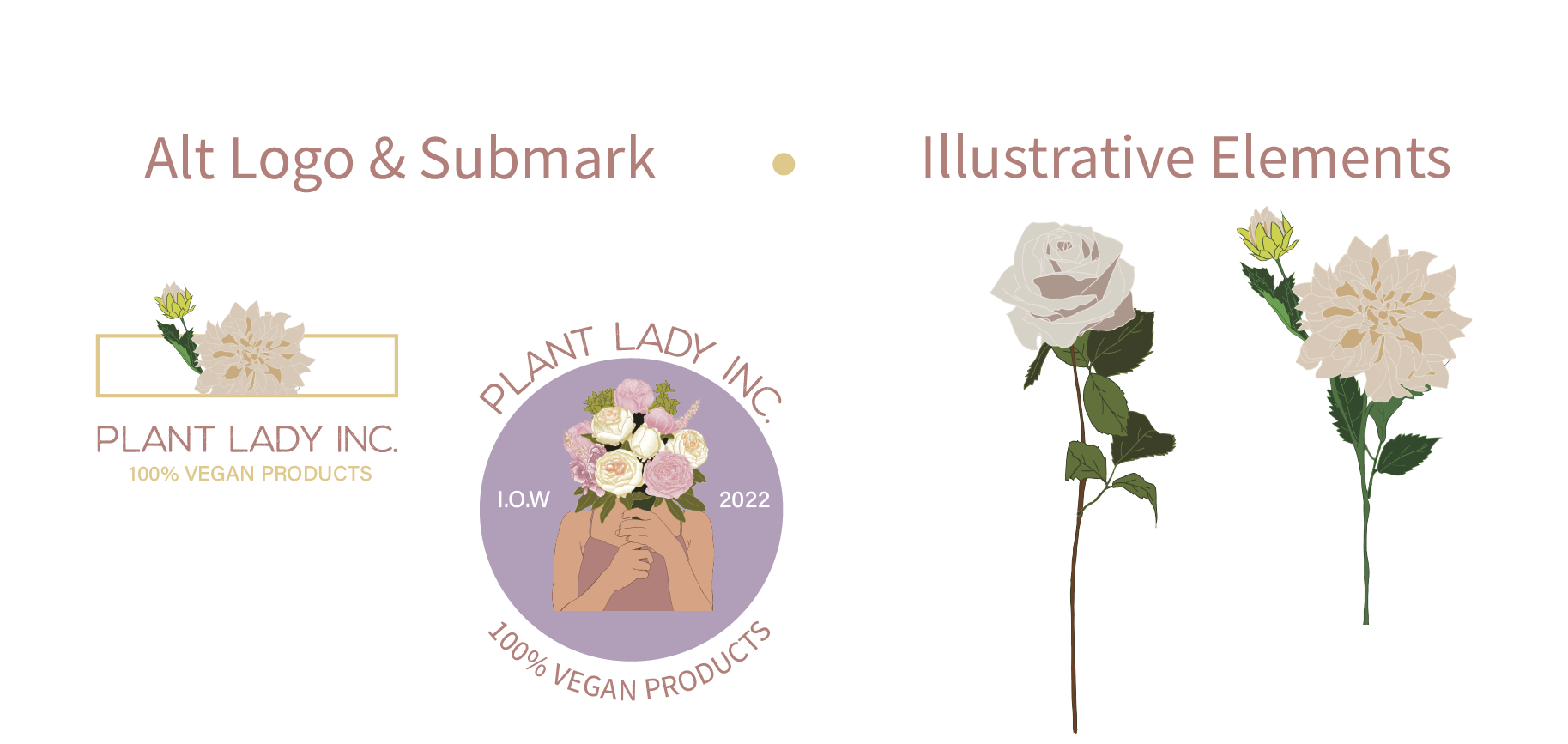
Primary Mark: A full-color, detailed illustration serves as the main logo, maximizing visual impact and communicating the brand's creative core.
Alternative Mark: A simplified, stylized floral icon was designed for smaller applications and to maintain print-friendliness and versatility.
-
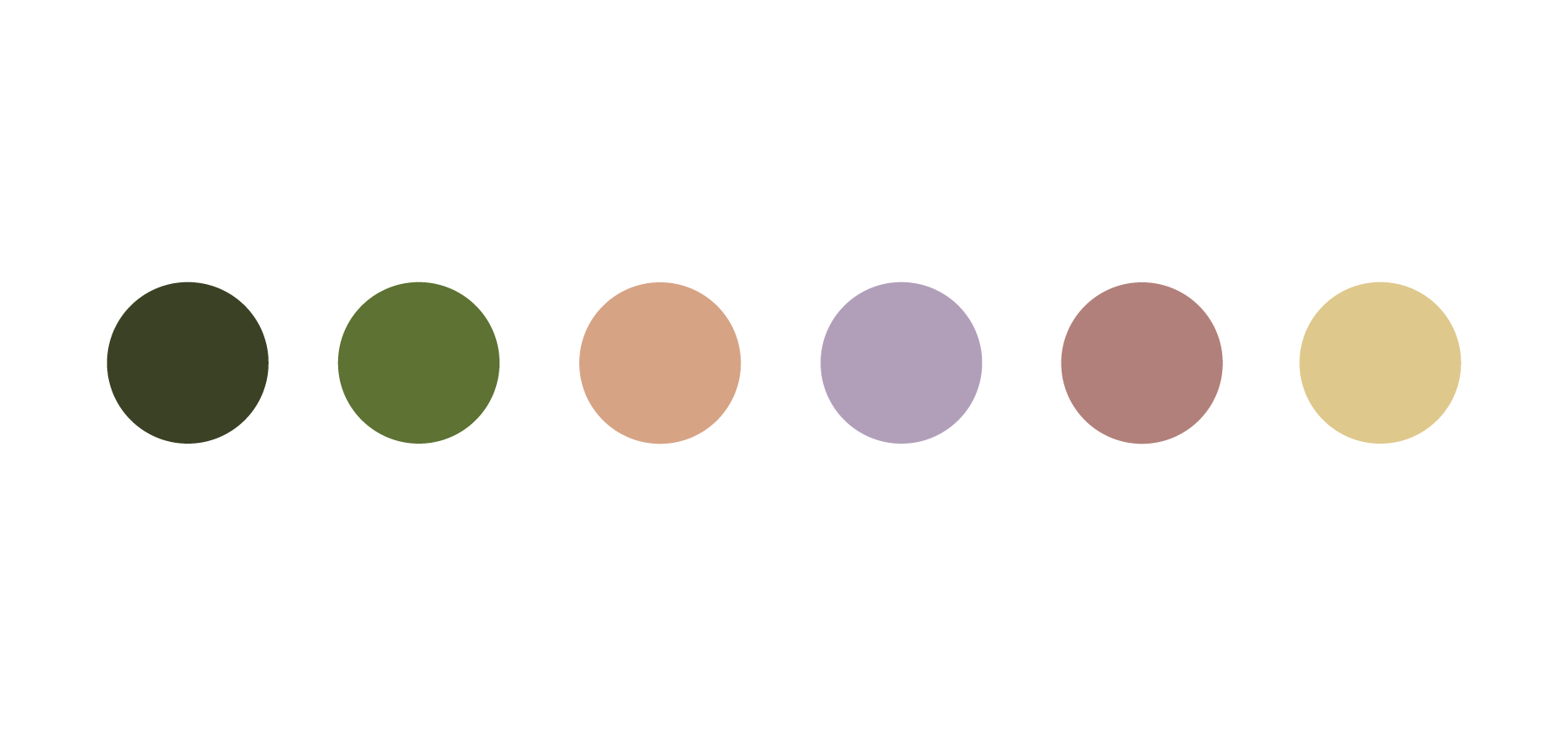
The selected color palette is intentionally delicate yet vibrant, chosen to reflect the natural colors of flowers while emphasizing feminine features and overall product wellness.
-
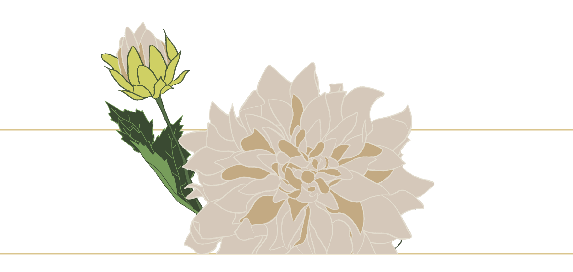
A set of vector-style floral icons was developed as a cohesive secondary element. These icons are designed for scalable use across digital platforms, enhancing web pages and packaging design with a light, recognizable motif.


