Interpretations: Exhibition Publication Design
Visions Museum of Textile Art (Publication Design)
This project involved the conceptual design and layout of the official publication for the Interpretations 2025 exhibition at the Visions Museum of Textile Art (VMOTA). The goal was to create a printed catalog that visually honors the complex texture, innovative creativity, and rich cultural traditions found in contemporary quilting and textile art. The design needed to serve as a sophisticated and lasting reference piece that elevates the museum's mission to celebrate and advance textile art globally.
-
The publication's layout was engineered to be a clean, structured canvas that beautifully frames the intricate details of the textile artworks.
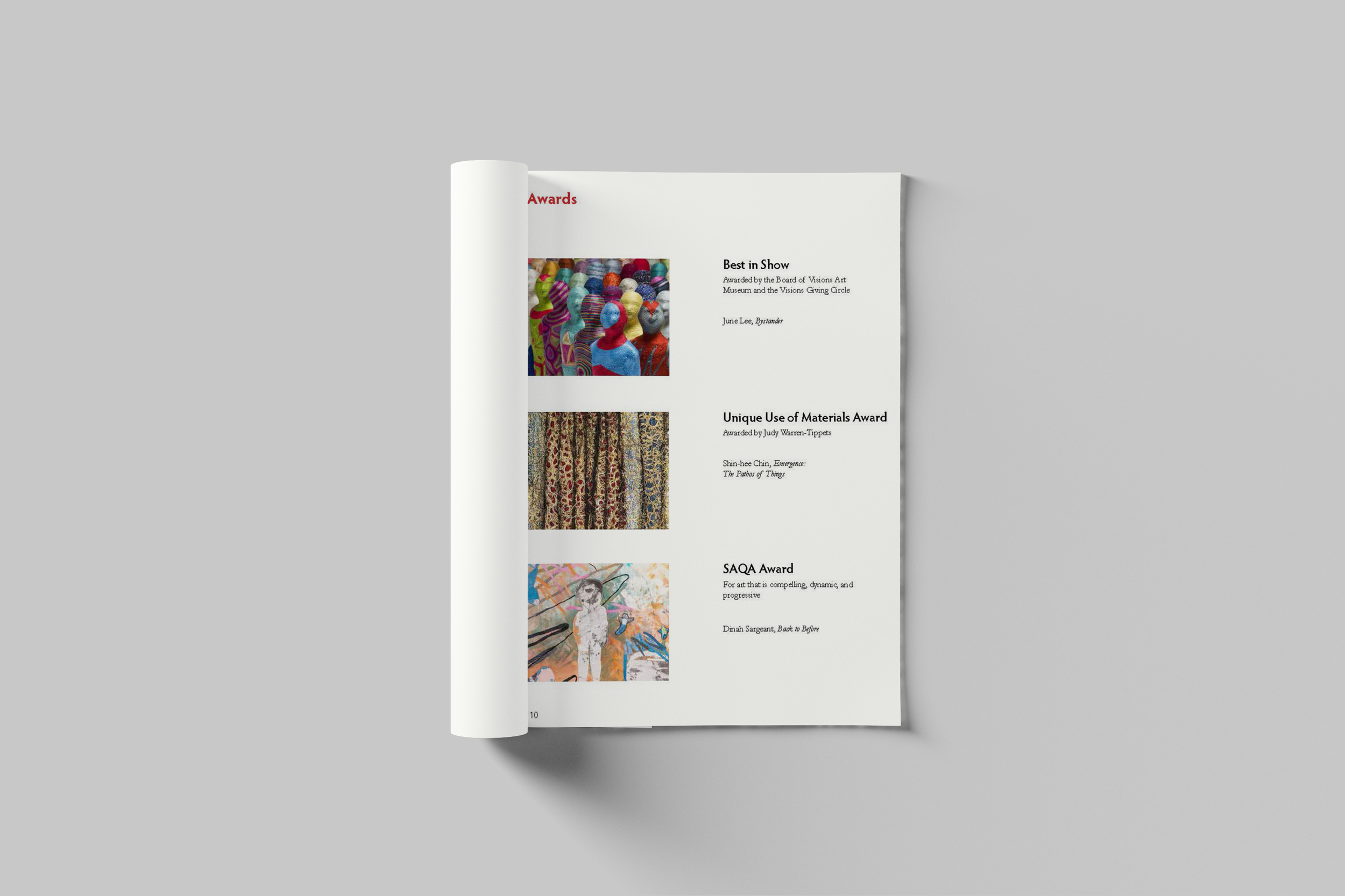
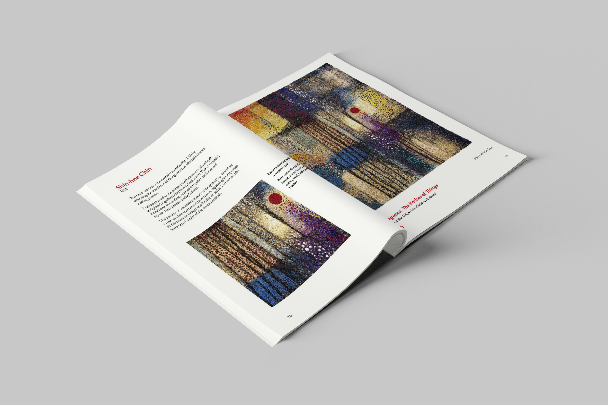
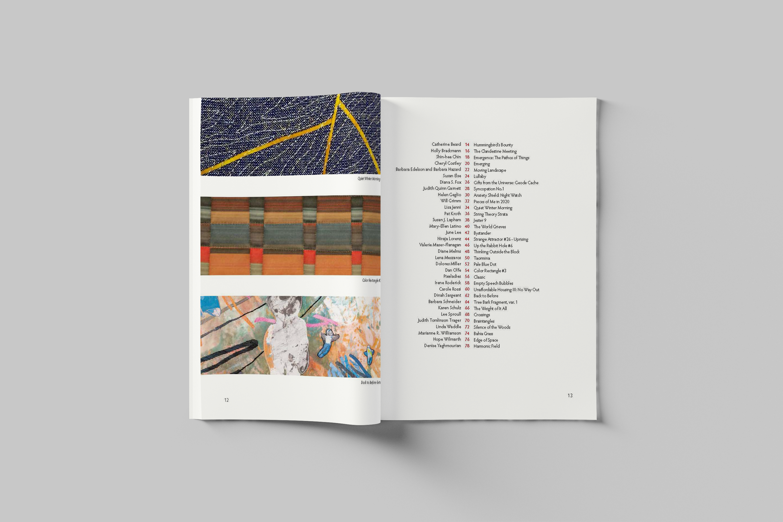
Grid Structure: A highly flexible yet precise grid system was used to accommodate the diverse shapes and sizes of the featured quilts and fiber art, allowing for both full-page spreads and detailed close-ups. This structure ensures a professional, museum-quality feel.
Typography: A combination of modern and traditional typefaces was chosen to balance innovation with heritage, mirroring the nature of textile art itself. Headings use a strong, clean sans-serif for titles and exhibition details, while the body text employs an elegant, highly legible serif font to ensure scholarly articles and artist statements are accessible and authoritative. The text placement is minimal on photo pages to let the art breathe, with ample white space to convey sophistication.
-
The design extended beyond the internal pages to create a cohesive brand experience for museum visitors and collectors.
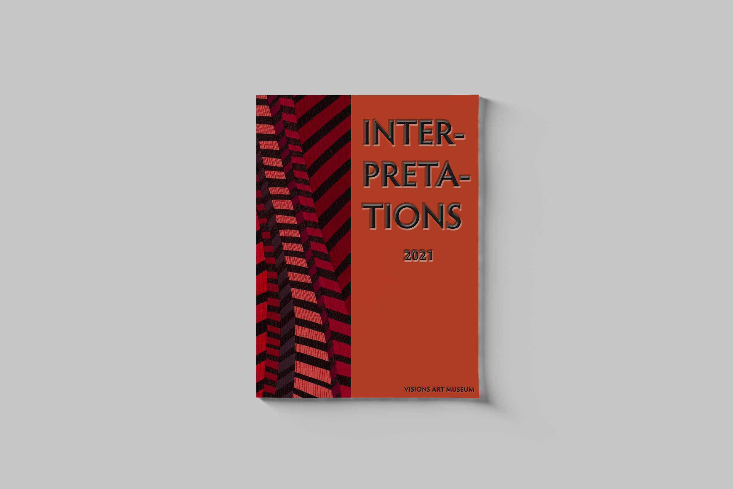
Catalog Cover (Packaging): The cover acts as the primary piece of packaging. It features a high-fidelity image of a key artwork, utilizing premium materials and finishing techniques to evoke a tactile experience that suggests the texture of textile art. The title treatment is prominent and modern, designed to stand out in a museum gift shop.
Supporting Materials: The project included conceptualizing accompanying print collateral, such as simplified exhibition guides or brochures that use the core visual elements and color palette of the main catalog. This consistency ensures a unified brand presence across all visitor touchpoints, from the gallery wall to the takeaway publication.
